
Encounter Group
Unifying multiple service divisions under a cohesive brand architecture, supported by stakeholder discovery workshops, stylescape territories, and comprehensive multi-touchpoint rollout.
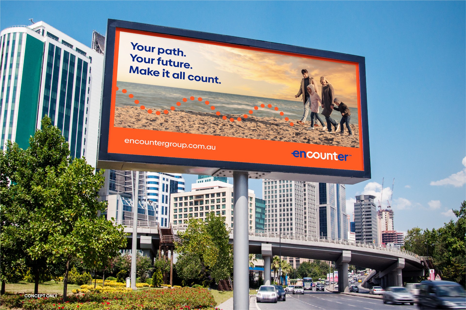
The Challenge: Fragmented brand equity
As Encounter Group expanded across residential developments, commercial property, and specialized project services, its visual touchpoints had grown disjointed. Individual sub-brands were diluting collective market strength, leading to customer confusion and missed cross-selling opportunities.
Red5 was appointed to lead a structured strategic rebrand: aligning key stakeholders around a single overarching masterbrand, clarifying divisional relationships, and developing a sophisticated visual language capable of bridging corporate authority with approachable human connection.
Strategic Phases & Execution
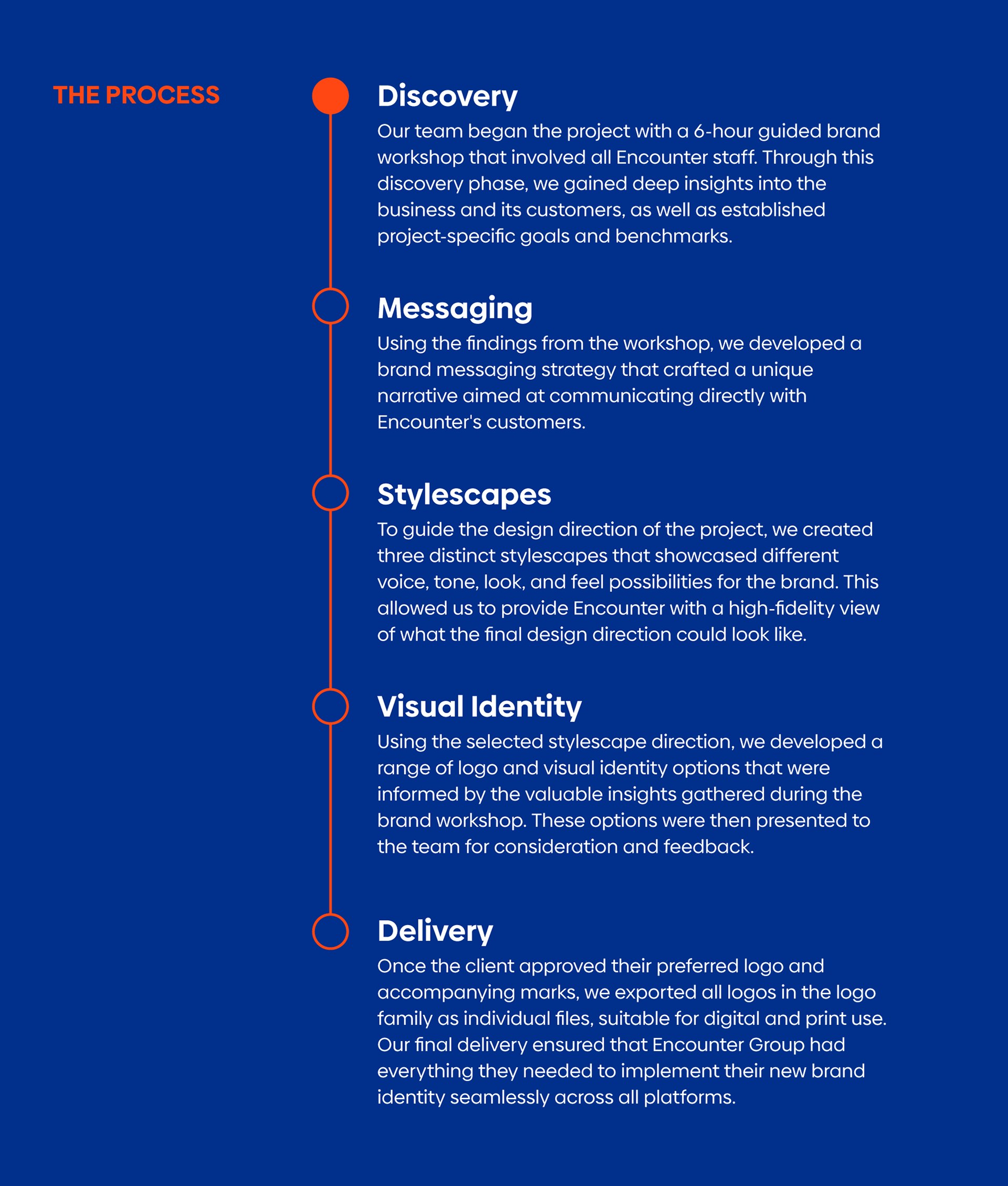
The engagement began with an intensive half-day discovery workshop involving Encounter Group’s leadership team, divisional heads, and key operational stakeholders. Through structured exercises, we mapped brand perceptions, defined competitive differentiation, and established consensus on masterbrand hierarchy.
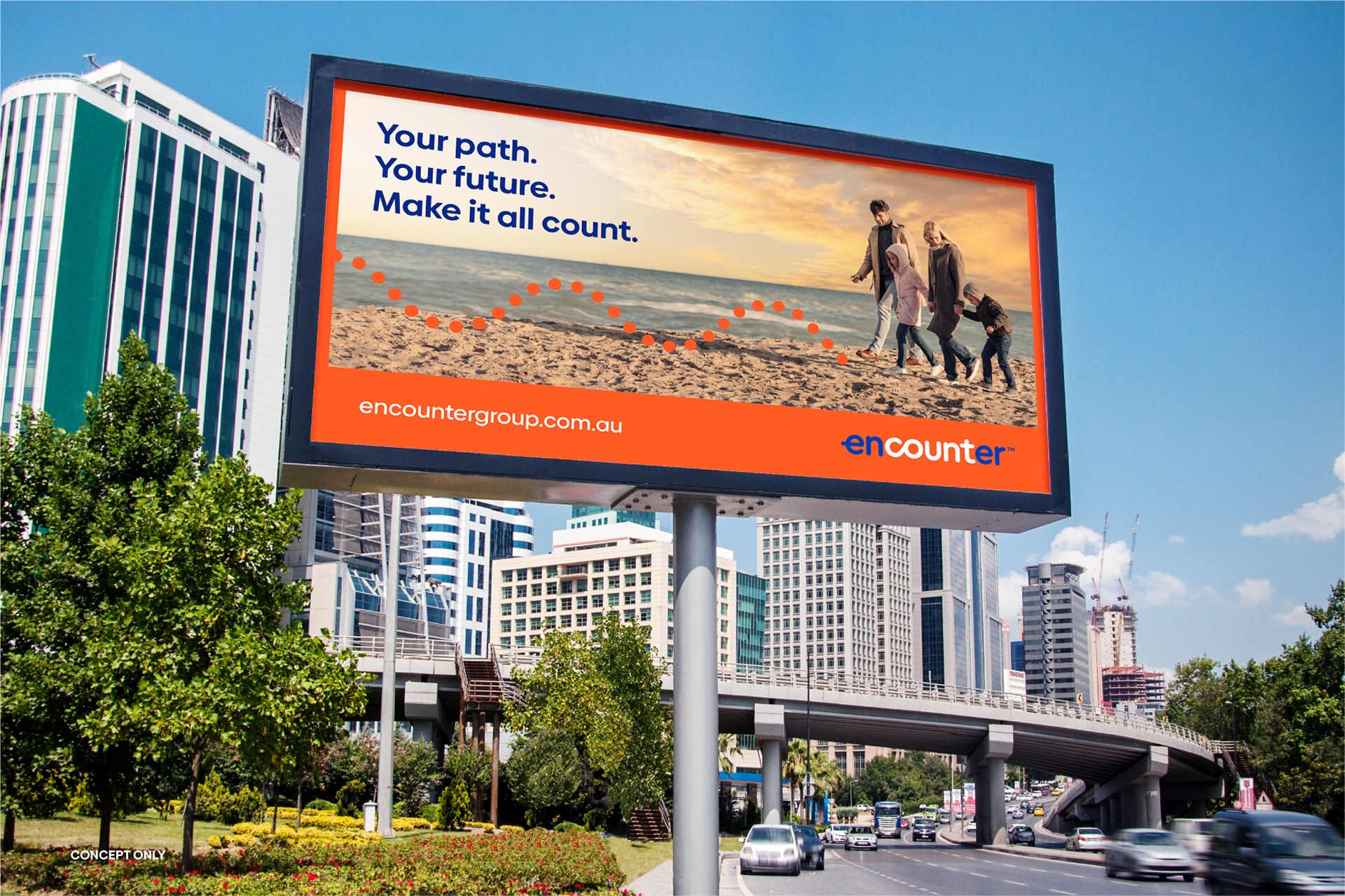
Brand architecture synthesis and divisional mapping.
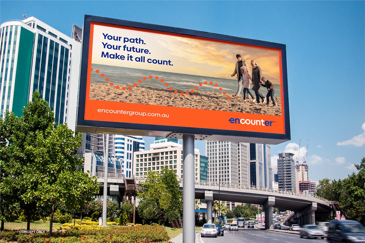
Audience touchpoint audit and customer journey priorities.
Following the workshop, Red5 developed a robust verbal identity framework. We crafted Encounter’s core value proposition, tone of voice pillars (Authoritative yet Accessible, Considerate, Forward-Looking), and tailored messaging matrices for both corporate investors and individual clients.
"Red5’s structured workshop gave our executive team complete clarity. For the first time, our entire group spoke with one voice and understood how our divisions empower one another."
Before commencing logo design, Red5 presented three distinct stylescapes—panoramic visual mood boards exploring contrasting aesthetic territories: colour harmonies, photographic style, typographic attitude, and spatial layout. This Pentagram-proven method ensured executive sign-off on the creative direction without costly guesswork.
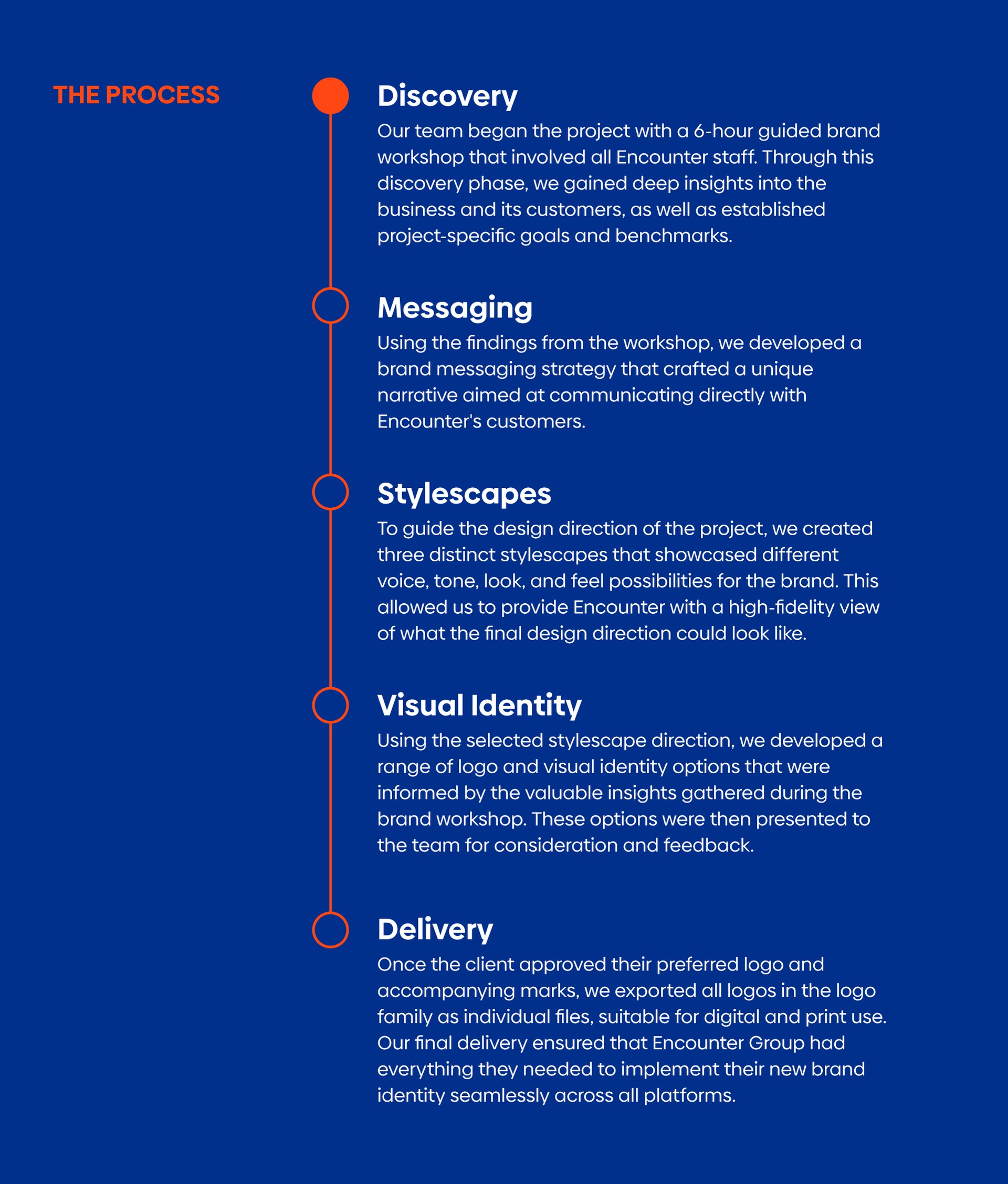
Selected stylescape territory: architectural precision balanced with organic warmth.
The final mark synthesises the letter 'E' and an open horizon line, capturing progressive movement and forward vision. A calibrated palette of deep charcoal, slate grey, and energetic vermillion red provides both institutional strength and vital modern presence.
Comprehensive identity system and divisional lockups.
The Outcome: Clarity, cohesion & market authority
The unified brand architecture gave Encounter Group an unmistakable market presence. Divisional silos were replaced with a clear, synergistic value proposition that increased customer retention, streamlined internal operations, and presented an institutional-grade brand ready for state-wide expansion.