
WBDM Fluid Power
Establishing technical credibility and industrial authority for an Australian hydraulic and pneumatic engineering specialist entering a highly competitive market.
The Challenge: Credibility in a precision market
Industrial engineering and fluid power sectors are traditionally dominated by legacy brands with decades of market presence. For WBDM, entering the market required an identity that immediately communicated deep technical capability, rigorous engineering tolerances, and unwavering reliability.
The brand could not look like a generic start-up or rely on tired industrial clichés like gears and generic swooshes. It needed to speak directly to plant managers, procurement heads, and field engineers who evaluate partners on precision, uptime, and safety standards.
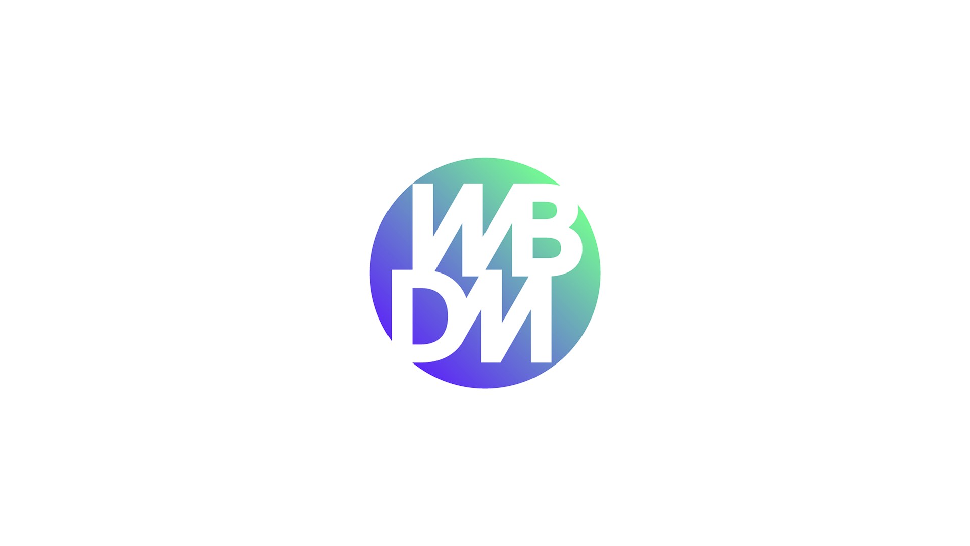
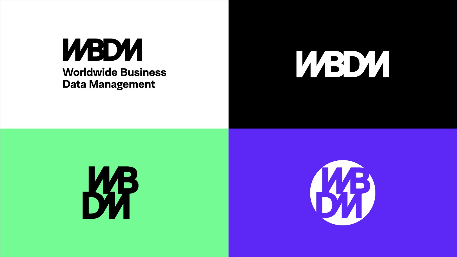
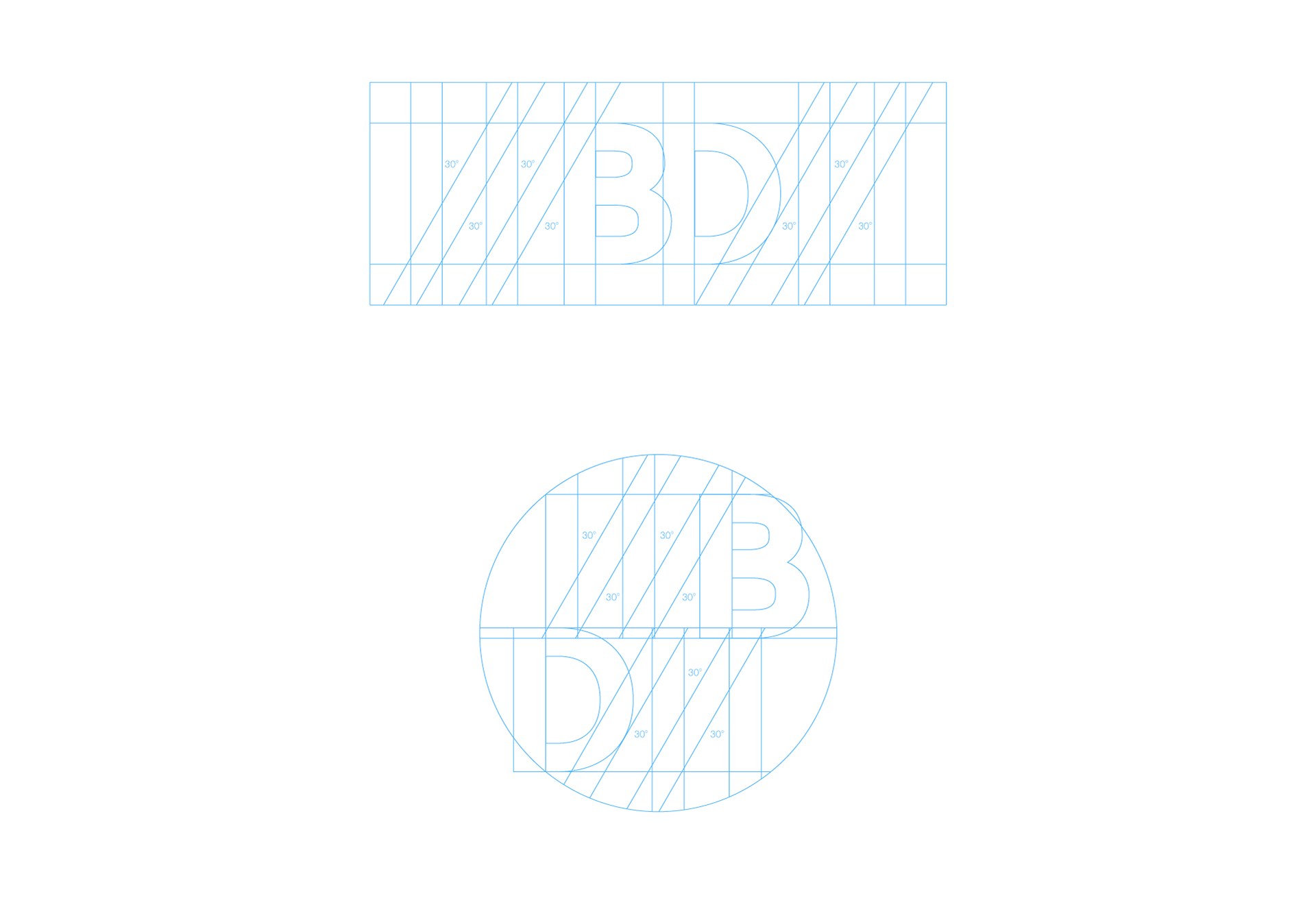
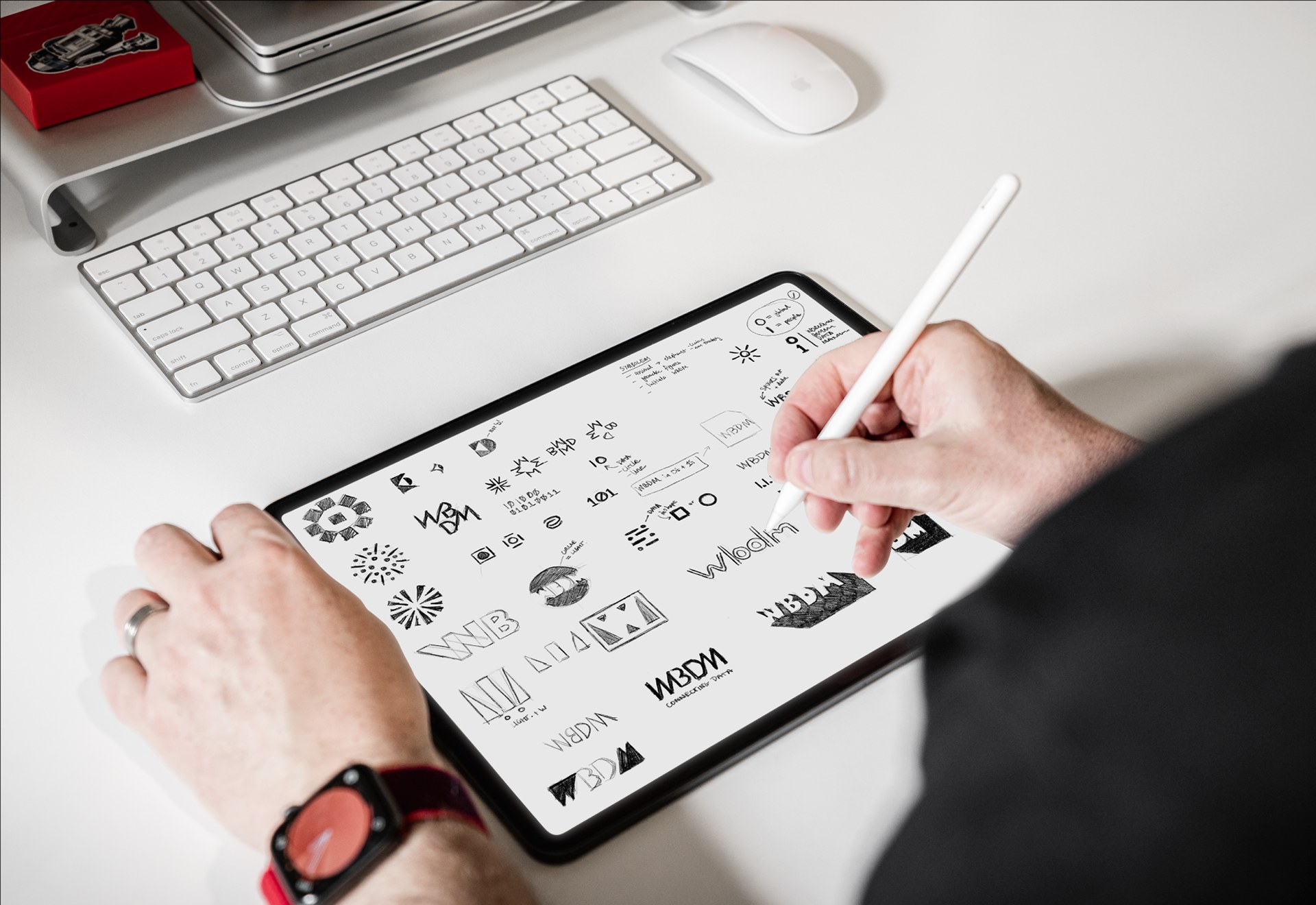
Geometric mark engineered on fluid dynamics and mechanical tolerance grids.
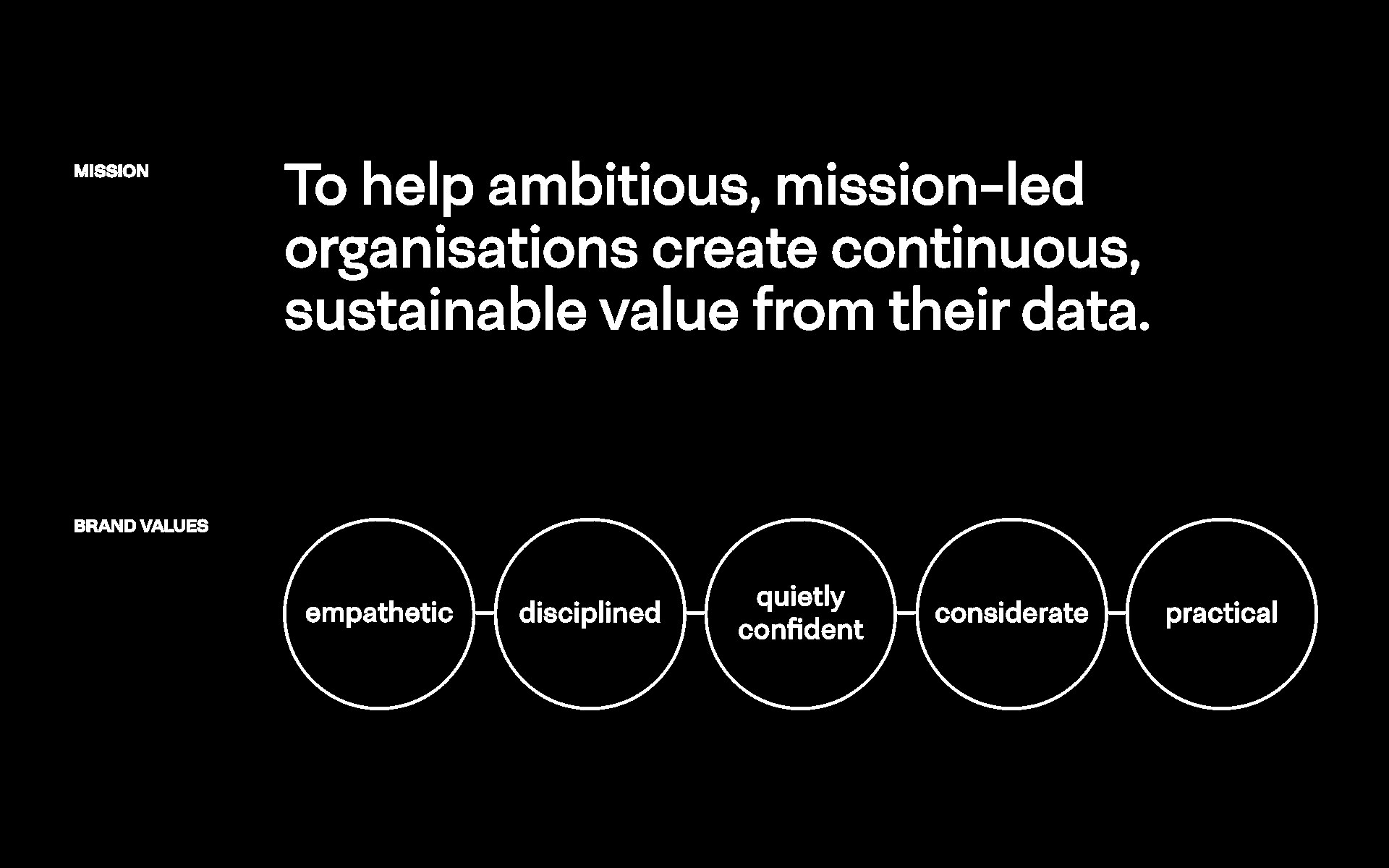
Monospaced and grotesque typographic hierarchy reflecting engineering schematics.
The Creative Approach: Engineering clarity
Red5 approached the identity through the lens of functional industrial design. The primary symbol was developed from the visual intersection of hydraulic valves, continuous fluid movement, and mechanical precision.
The colour architecture pairs high-contrast industrial charcoal and crisp white with safety-grade warning accents, ensuring instant visibility across high-risk field environments, workshop signage, and technical schematics.
The typographic system pairs an authoritative, heavyweight sans-serif for high-visibility trade signage with a structured monospaced secondary face for technical specifications, product codes, and engineering data sheets.
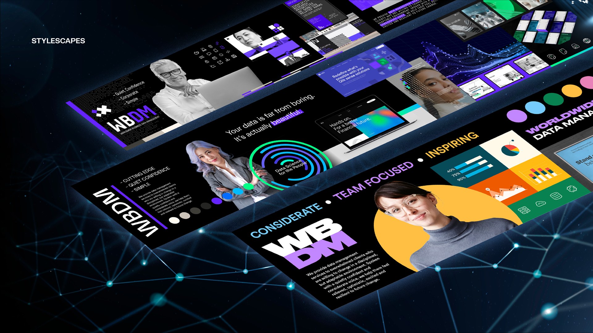
Facility signage and industrial site entrance branding.
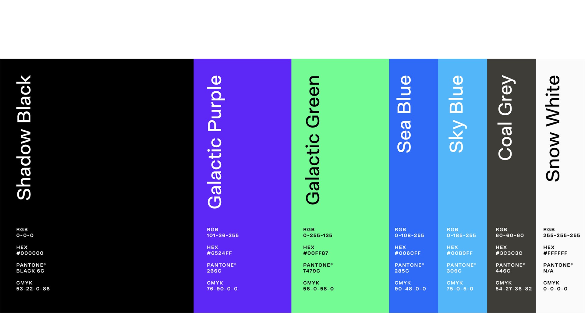
Standardised colour values across PMS, CMYK, RGB and RAL industrial coatings.
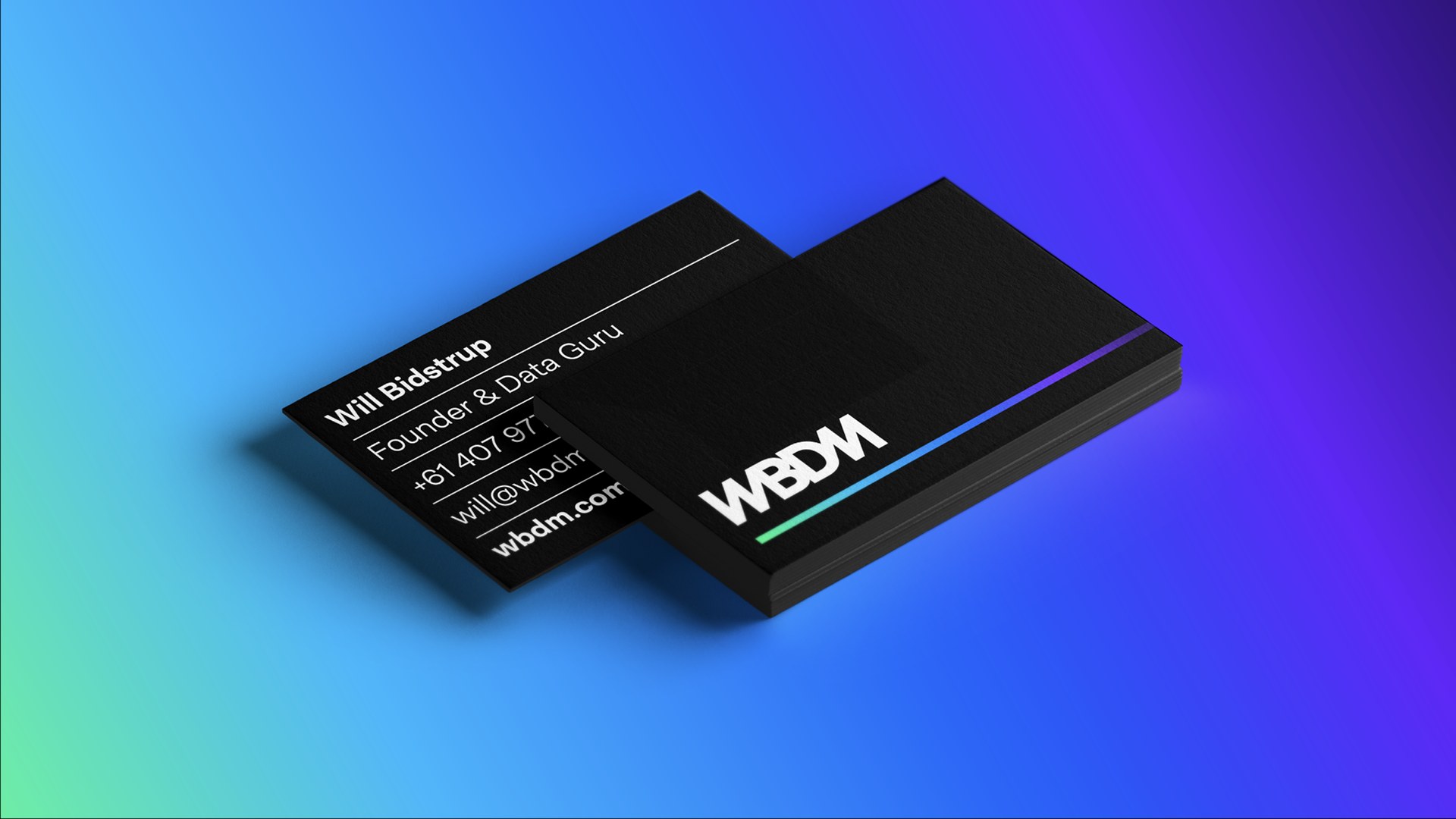
Formal corporate stationery, tender submission documents, and warranty cards.
High-visibility service vehicle fleet livery designed for maximum regional road presence.
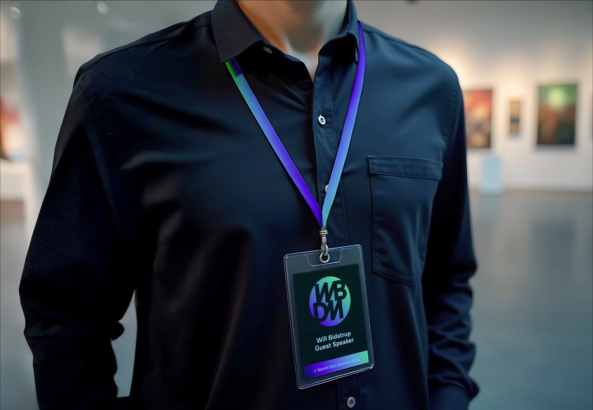
Site PPE and uniform system meeting Australian safety compliance standards.
Responsive digital platform structuring technical capabilities and rapid quote requests.
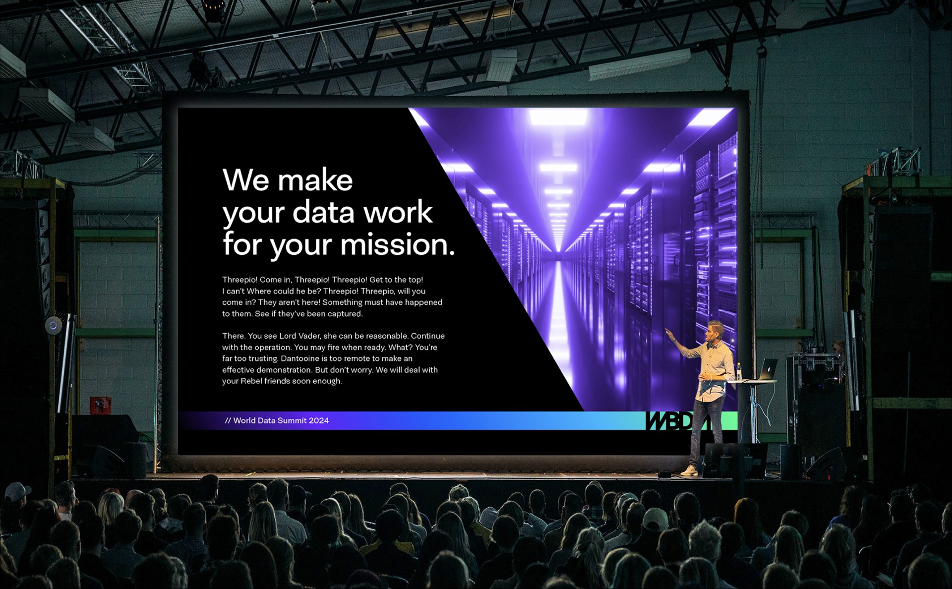
Modular trade exhibition presence showcasing hydraulic power units and testing equipment.
The Outcome: Immediate industry standing
The resulting brand positioned WBDM not as a newcomer, but as an established, formidable engineering partner. With consistent visual execution across their facility, vehicle fleet, digital channels, and field documentation, WBDM successfully secured tier-one industrial contracts within their first operating year.